Friday, 28 September 2012


This image is by photographer, Fay Godwin. The image I would say is split in to two sections. The bottom half being the road and fences, the top being the sky and the mountains. The road acts as a a central mark and makes the eye travel inwards, towards the mountain. The sky has many shadows and highlights. It seems to start off more black and go down in tone.

This photograph is by photographer, Richard Avaden. My eye goes straight away to the dramatic hair style she has. I find the harsh shadowing on the left hand side effective and there are many different highlights included in the models hair. I think if more of the models body was included in this photograph it wouldn't be as effective, simply because the main theme of the photograph is her hair. I like how the whiteness of her skin contrasts with the grey/black of her hair.


This is a image by photographer, Dorethea Lange. I think this photograph has a dramatic effect and expresses the emotion sadness. The children are faced the other way which makes me think that there is something they do not want to see. The lines included in the mothers face are very harsh, like life has taken a lot out of her. I think if this image was in colour format it wouldn't be as effective as the eye would focus more on the colours rather than the matter at hand.

Thursday, 27 September 2012


This is a video showing 15 photographs I captured today around Chesterfield town centre. I think I have captured many different situations. At first I found the task quite scary and awkward as I was scared of how people would react when taking photographs of them. My favourite image, is image 5, of the over weight man sat on the wall. This is because I managed to capture his facial expressions whilst he was sat on the wall. This task made me look more at everything, scanning areas for what would look like a good photograph.

Wednesday, 26 September 2012

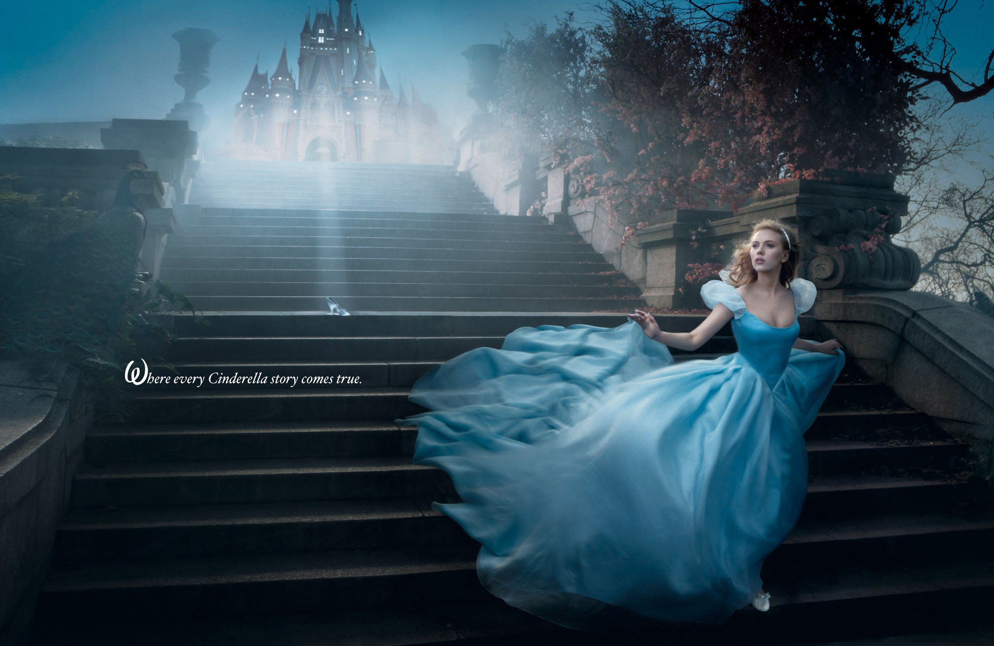
When looking through images by Annie Leibovitz, I found her Disney series. In this series she has recreated scenes from Disney and used celebrities to do so. For me Disney was a big part of my childhood and is still part of many others. Although many of the series is made through the model and a green screen and Photoshop, I still find the images effective.I chose this image not only because Cinderella is one of my favorite characters but because I love the movement which is shown in this image. The dress is flowing down the stairs gracefully, seeming like water. At first I didn't notice the slipper on the steps but then realised it was highlighted in a spotlight.
This image was created by photographer Sandy Skoglund. There are only two words to describe this photographer and is weird and wonderful. The image is mostly covered by orange crisps. I find how some of the models have skin showing effective because it gives the photograph sections and they don't all blend in, which is easier on the eye. The models are positioned in different areas of the room, giving the photograph depth. The crisps give off a fantastic texture for the photograph. My eyes immediately stop at the man in the foreground first because he is the one with the most movement. Sandy Skogland is also an artist, and uses photography to vreate movement and line drawing.
This is a picture by photographer Steven Klien. The thing I immediately notice is the awkward position the man is positioned in. I like the use of colour in this picture, although it is very limited, the black and the blue give off a great effect. The blue for me makes the models look paler and lifeless. Both models are in very strong poses and I think if they were to be moved closer the picture wouldn't be as effective because it would make the photo seemed compressed and crowded. The woman's pose is very strong and dominant which makes me think that she is almost controlling the guy, as if he is falling head over heels for her.